


Historic Manuscript Archive – PUBLISHED VERSION
Computer Art with Basic for apple II
Herbert W. Franke (9/1984) – article published in the German popular magazine “Heim Computer”

Instead of a brush, a monitor uses an electron beam. Instead of a canvas, a luminous glass pane. It doesn’t need a hand to apply paint – electrical impulses do it for him. It is a pleasure to watch him work: In a flash he throws coloured strokes onto the screen, you can’t look that fast – and the painting is finished.
The magic of electronic images, the speed, the precision… whoever watches them being created for the first time is thrilled. And the joy of it doesn’t diminish when you have become an accomplished programmer and the computer executes your own programs.
It’s the idea that counts
Two things have to come together in art – the idea and the technique. The computer takes the technique off from us, and so we can concentrate on the idea.
Computer graphics did not originate due to artistic purposes, rather it was the desire to make data from science, technology and business visible in a memorable way. You don’t need ideas for this – the business shares and balance sheets – or whatever – are given. On the other hand, anyone who decides for the first time to use the computer graphics system as an artistic instrument will first ask himself what he actually wants to depict. He must have the ideas himself, but there are a lot of suggestions and tips that can make the task easier. I want to give suggestions for artistic designs by means of some examples now. Since I have an Apple II at my disposal, the programmes are written in the corresponding BASIC version. However, they are by no means limited to the Apple – anyone who has understood the concept can easily transfer them to any other graphics-capable home computer.
We learnt it from the mirror
Maybe we shouldn’t start with the high art right away, the small one might be enough for the beginning. And what is that beautiful saying? – Symmetry is the art of the little man. We encounter symmetrical things in nature at every turn. Flowers and leaves are typical examples, but also the bodies of animals – not excluding those of humans. But even here it becomes clear that not all symmetry is the same. For example, the law of form of a flower is clearly different from that of an animal skull seen from the front. But there are also other principles of symmetry that are not necessarily realised in nature, but can easily be produced with the computer. The old art of ornamentation is therefore far from obsolete; it is precisely the computer that is capable of reviving it completely.
The principle of repetition
The simplest form of symmetry – whereby we now restrict ourselves to the two-dimensional space – is mirror symmetry. What appears on the right is also found on the left… Repeat laterally inverted – this labelling is enough to get a grip on the matter.
So, first we need an axis – for which a coordinate axis, preferably the y-axis, is ideal. As it is usually located on the left-hand edge of the image in computer graphics fields, we need to move it to the centre. This is the simplest form of “transformation”:
A replaced by H+A
In order to achieve the first result, a bilateral shape, we distribute some arbitrary graphic elements, for example rectangles, in the left half of the image. A mirror image means nothing more than a change of sign in relation to the mirror axis. In our case, this applies to the graphic instructions: In addition to PLOT H + A, H + B, also PLOT H – A, H + B must occur. Corresponding rules apply to other graphic instructions such as VLIN and HLIN.
The same procedure could of course have been carried out on a horizontal axis:
B replaced by H+B
and:
In addition to PLOT H + A, H + B, also PLOT H + A, H – B must occur. Corresponding rules also apply to VLIN and HLIN.
This results in the reflection effect that we can observe on a calm water surface. Otherwise, nothing significantly new comes to light.
The ornamental effect is greatly enhanced if the mirroring is carried out on both the horizontal and vertical axes. The following then applies:
In addition to PLOT H + A, H + B, also PLOT H + A, H – B or PLOT H – A, H + B and PLOT H – A, H – B must occur in order to obtain double mirror symmetry, you only need an initial image in the format of a quarter of the whole image area.
This results in a simple type of kaleidoscope, a toy favoured by computer graphic artists. Nothing prevents the kaleidoscope image from being set in motion by constantly applying new graphic elements in changing colours.
A form of symmetry that rarely occurs in nature is obtained by point mirroring. It is expressed as follows in the programming instructions:
In addition to PLOT H + A, H + B, also PLOT H – A, H – B must occur.
Compared to mirror symmetry, in which the left-hand image is only folded over once – to the right – point symmetry requires the image to be folded over twice: First, the figure of the left half is folded to the right, and then the part of the image that now appears on the right side is folded again around the horizontal centre axis.
The electronic play die
Similar to computer games, the random command, given in Apple by RDN (1), is also of particular importance in computer art. If you call it, the computer outputs any number between zero and one. You can use this process as a die and leave some decisions to the computer that you would otherwise have to make yourself.
In principle, you can assign a random number to each variable; in the case of computer graphics, this will be particularly necessary for coordinate specifications or colour selection.
The scope – decimal numbers between zero and one – may not seem very appropriate for this task, but nothing could be simpler than extending the range of the diced numbers. For example, if we are dealing with the integers between zero and fifteen, which the low-resolution graphics on the Apple II show, then we extend the random call in the following way:
FARBE = RND (1) * 16
This results in a uniform distribution of numbers between zero and 15.999 999… If you assign this expression to the symbol for colour –
COLOR = FARBE –
then the decimal places are cut off – so you don’t need to worry about the integer value of the colour information – and constantly changing colours appear on the screen.
Of course, you may want to reduce the colour palette on purpose. The easiest way to do this is to select a smaller group from the selection range of sixteen. This can be done, for example, using the command
FARBE = RND (1) * 6
or the command
FARBE = RND (1) * 6 + 4
happen. However, you are still limited to the predefined sequence of colours. However, additional commands can be used to swap these colours, for example in the following way:
IF INT (FARBE) = 5 THEN FARBE = 14
IF INT (FARBE) = 7 THEN FARBE = 12 etc.
If you want to leave not only the choice of colours but also the choice of positions to the computer, then use the random generator to determine the coordinates, for example for the corner points of the rectangular elements. For the low-resolution graphics of the Apple II, a range between zero and thirty-nine is required for both the x and y values:
x = RND (1) * 39,
y = RND (1) * 39.
If you are dealing with other picture grids, proceed in the same way.
Only now does the above suggestion for a kaleidoscope lead to a satisfactory result! We leave both the choice of coordinates and the colours to chance; since the initial figure only covers the upper left quarter, we only need to provide a range between zero and nineteen for A and B.
The model of manual work
When you start experimenting with computer graphics, you involuntarily follow the example of painters and graphic artists who work by hand. This means that one element after the other is applied, dots, strokes, bars…. and these are grouped as you wish. In addition, the colour is selected. As long as the corresponding colour is not changed, the computer applies the elements in this colour. This also corresponds to the painter who dips his brush into a pot of paint and then stays with his colour until he decides on another one.
However, the computer graphics system also enables a completely different way of working, which is more like the television picture. We know how this works: the electron beam scans the screen line by line, touching all the screen dots. With a black-and-white screen, the intensity of the electron beam changes from dot to dot, and this is how the grey-scale image is built up. With a colour screen, each dot must also be assigned a colour value.
The computer graphic artist can also proceed in the same way. Using his program, he first focuses on the first raster element, usually at the top left, and assigns the colour to it. The same is repeated for the second point in the line, then the third and so on. And as with television, the image is built up in this way.
The scanning process is easy to achieve with the help of a few programme instructions:
FOR Y = 0 TO 39
FOR X = 0 TO 39
PLOT X, Y
NEXT: NEXT
The important thing is the colour. However, while we know quite well how to create an image when applying graphic elements, this is much more difficult in the case of our “raster graphics”. However, the interesting thing about this is the fact that you can achieve completely different types of images this way than using the conventional method.
Of course, this method would be extremely cumbersome if you wanted to define the colours in the programs point by point. There are various ways to avoid this, for example by using randomisation. However, it is even more exciting if you determine the colour with the help of mathematical or logical functions. For the mathematicians among our readers, it should be noted that these are functions of two variables, i.e. of the type
z = f (x, y).
You can visualise the z as a height above a field built up by x and y coordinates. Just as with maps, the height ranges can also be indicated by colours.
But even for those who are not particularly enthusiastic about mathematical questions, the grid method can prove to be productive.
No fear of mathematics
The BASIC that we use for our graphics also understands the usual symbols of algebra, for example +, -, /, and so on. As we all know, these symbols can be used to connect different variables and thus obtain expressions for which mathematicians have special names. However, we will not concern ourselves with this here, it is far more informative to try it out for ourselves. In principle, two lines of programme are sufficient for this:
z = X ˄ 2 + Y ˄ 2
COLOR = z
PLOT X, Y
Of course, this process does not work completely without thinking. For example, you have to make sure that the numbers assigned to the colours do not become negative and – in the case of the GR graphic of the Apple II – do not exceed fifteen. However, this is easy to prevent:
IF z > 15 THEN z = z – 15
This method is limited to a certain extent by the computing time. Even slightly more complicated expressions cause waiting times of several minutes, even with low-resolution graphics. If you want to try the same thing with high-resolution graphics, you should allow a whole night to build up the image – you can then view the finished image after breakfast.
During the first few experiments, you will experience many a surprise, and some of them will be unpleasant, as not every experiment leads to the desired result. Over time, however, you will learn surprisingly quickly which configurations can be achieved with mathematical formulae, and only then will surprising new territory open up. The computational processes that are available on every computer turn out to be form-creating elements that, given some experience, can be used in a specific way to produce images.
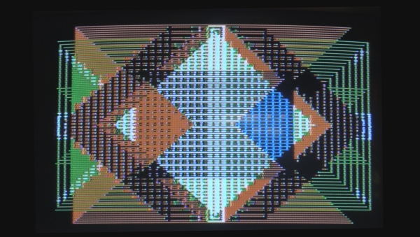
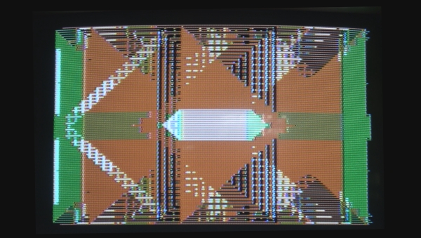
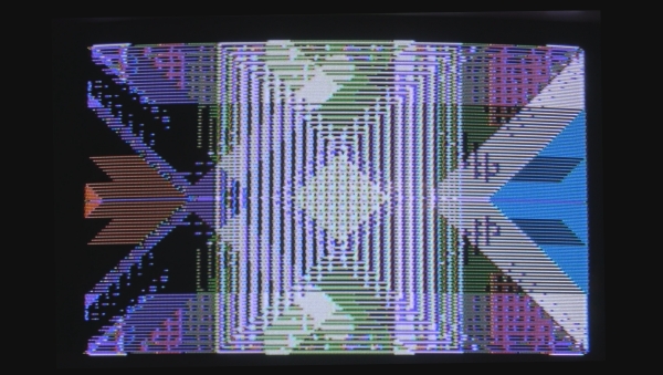
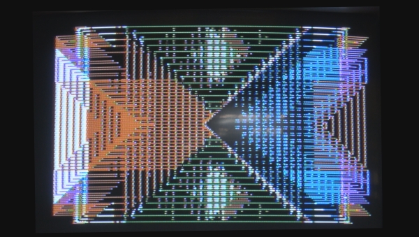
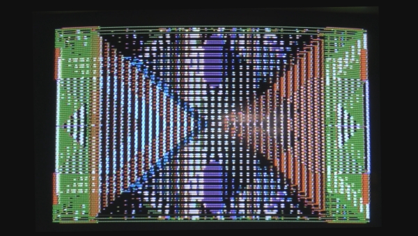
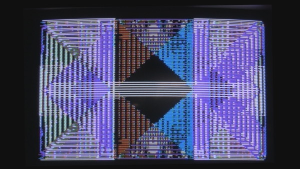
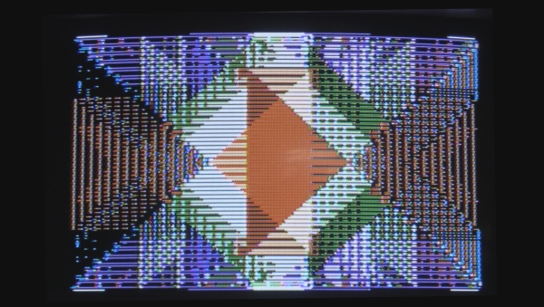
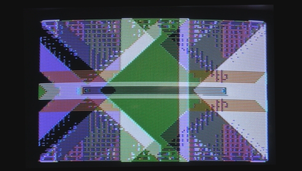
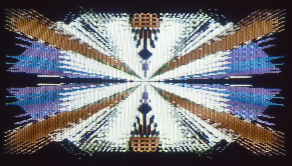
Moirés: interaction between the code and the screen
As already mentioned, with high-resolution graphics it is the time required that prohibits the use of complicated calculations. You are more likely to make do with simple elements, especially strokes, to create your graphics. Strangely enough, however, there is a trick that always leads to surprising visual effects. In the simplest case, it is the dissolution of lines into staircase curves – which naturally annoy scientists and technicians, as they reduce the precision of the reproduction. However, when applied in a targeted manner, this phenomenon often leads to surprising patterns, squiggles and garlands – structures of such a high degree of difficulty that targeted programming – especially if you only have a home computer at your disposal – would take days.
The patterns that emerge are not predetermined by the image-describing data, rather they are created by an interaction with the screen. This always happens when the scale of the graphic elements, for example the line thickness, approaches the resolution limit of the image grid. The image and the screen interact in the same way as two fine silk fabrics viewed through the light. There, this effect is called moiré. In the special case of screen graphics, these moirés can also be coloured. This, too, is quite welcome to the user of a home computer, not least because high-resolution graphics usually provide only a few colours. This palette can be expanded in this way.
A few tips can also be very helpful for creating moiré patterns. If you place the strokes very close together, there will be no moirés, but rather uniform areas of colour. If the distances between them are too great, the staircase effect will appear, but an overlapping pattern will not occur. It is best to leave distances between the line elements that roughly correspond to the line thickness. In particular, if these straight lines are not parallel but at an oblique angle to each other, new, remarkable variations will always emerge.
In the two exemplary programs that I place at the end of this introduction, all the effects described were utilised. The resulting figures are symmetrical in four lines; with the help of random generators, both the colours and the image-determining coordinates change. In the process, any number of build-up processes are set one after the other; the consequence of this is that the following image is superimposed on the previous one. In this way, an additional variety of picture design is created, since there are also interactions between the individual parts of the picture. In order to achieve great variability in this direction as well, random generators are switched on that also change the line spacing in an unpredictable way.
Computer graphics in high resolution
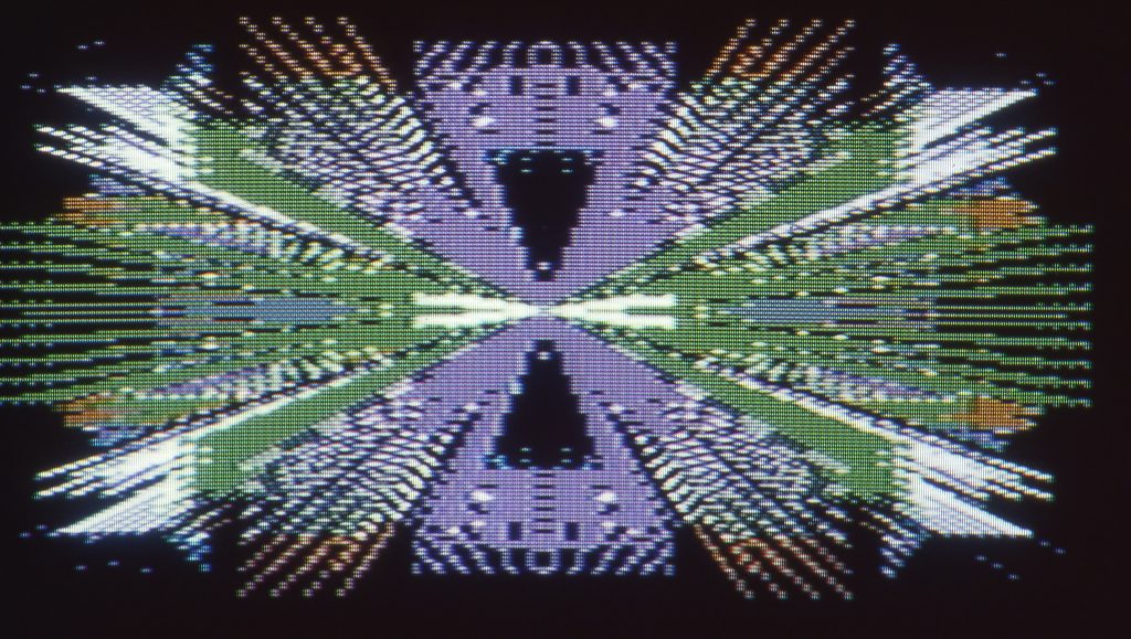
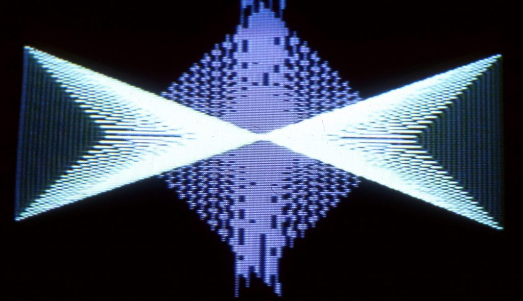
The first program, MIKADO, is still very reminiscent of the well-known kaleidoscope figures. According to the conception, simple pictures are created at first after switching on, which gradually become more complicated by the addition of further elements. It is then up to the user’s taste at which point he considers the picture to be complete and stops the sequence. The second program, BUEHNE, also makes full use of the moiré effect. A square lying in the centre of the surface serves as the base from which the images fan out. A random generator determines whether the line elements are applied in the direction towards the centre or outwards. As they lengthen in the process, the impression of rectangular surfaces in perspective is created. One could imagine the whole thing as a view of a stage bordered by ornamentally decorated floor, ceiling and side surfaces. However, images of this kind could also be used practically – for example as a background for a writing placed in the middle.
The second program, BUEHNE, also makes full use of the moiré effect. A square in the centre of the surface serves as the base from which the images fan out. A random generator determines whether the line elements are applied in the direction towards the centre or outwards. As they lengthen in the process, the impression of rectangular surfaces in perspective is created. You could imagine the whole thing as a view of a stage bordered by ornamentally decorated floor, ceiling and side surfaces. However, images of this kind could also be used in a practical way – for example, as a background for writing in the centre.
Outlook to the Future
In contrast to conventional fine art, there are still no fixed rules, no evaluation system for computer graphics. Anyone working in this field therefore has the greatest possible freedom – and far more chance of creating something new and unprecedented than a painter or graphic artist working with hand tools. Of course, not everything that is created with the help of computer programs has artistic value, but why shouldn’t these simple beginnings one day give rise to something that is on a par with the great works of painting? Above all, it is important not to lose heart if not everything works at the first attempt.

